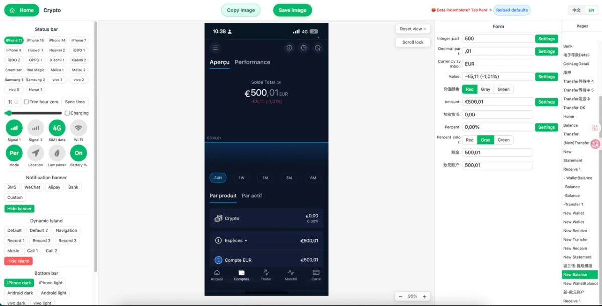
Understand what “fields not lining up” means in a Phantom wallet tool
Choose the right screenshot template before editing any fields
When using the online editor in your browser, begin with category browsing and then narrow the results with keyword search. Terms like wallet, crypto, balance, transaction, token, and fintech UI help surface layouts that are closer to the visual structure you need. If your goal is a holdings screen, pick a template with a strong balance header and a clear asset list. If your goal is a transfer detail screen, choose a layout built for addresses, status labels, and timestamps.
A good template choice is the foundation of clean alignment. Once that is done, every later step in the online editor becomes simpler, faster, and more accurate.
Map each editable field to the live preview in the online editor
This browser-based editing style is one of Zoobic’s strengths. You do not need Photoshop or any separate layout software. The screenshot template is already structured, and the online editor lets you adjust content directly. That means less time spent troubleshooting and more time refining the final visual quality.
It also helps to keep field order consistent with the design. If a token symbol belongs beside an amount, do not move that information into another field just because it seems visually close. The template has a built-in rhythm, and following that rhythm keeps alignment more stable. Once you know which field controls which line, the rest of the editing process becomes much easier and more predictable.
Fix spacing by shortening content instead of forcing the layout
Zoobic supports this kind of refinement well because the browser editor is built for direct field changes rather than manual layer editing. You are not redesigning the interface. You are fitting your content into a structure that already works. That is why concise content nearly always produces a better mockup than trying to force more information into the same space.
For creators making presentation graphics, social content, or UI references, this approach also improves consistency across multiple screenshots. If each screenshot template uses similar content lengths, future edits are less likely to break alignment. A small reduction in text often creates a large improvement in visual polish.
Keep numbers, labels, and amounts visually consistent
Start by checking the main amount. This should usually be the strongest visual element on the screen. Then review the supporting lines, such as fiat estimates, token counts, or smaller labels. These secondary fields should support the main number rather than compete with it. If every line uses long decimals or heavy formatting, the mockup starts to feel crowded.
Zoobic makes this easy to refine in the online editor because you can test alternate formats directly in the browser. You can reduce decimal precision, standardize token abbreviations, and keep date and time formats consistent across the screenshot template. For example, if one row uses a short time style and another uses a long date string, the mismatch may make the screen look less organized even when all fields technically fit.
A mockup does not need excessive detail to feel realistic. It needs consistency. When amounts, symbols, and dates follow a shared pattern, the screenshot template looks intentional. That is often the difference between a rough browser edit and a polished export PNG ready for content creation, UI study, or visual presentation.
Adjust the status bar so the screen feels natural
Zoobic includes status bar controls inside the online editor, which is useful for matching the overall visual tone of the mockup. In the browser, you can adjust details such as time, battery level, signal strength, and other top-area indicators. These small elements shape the perceived realism of the screenshot template and should be treated with the same care as balances or transaction labels.
A practical rule is to keep the top bar visually proportional to the content below. If the time is too long or too bold, it may draw too much attention. If icons feel too dense, the screen may look compressed. The goal is not to overload the top area with detail but to maintain the same spacing rhythm used across the rest of the mockup.
Use transaction layouts carefully to preserve alignment
Long addresses are the most common issue in a transaction screenshot template. If a sender or receiver line is too wide, it can push adjacent rows out of alignment or create awkward wrapping. In Zoobic, the better approach is to trim the visible address format so it remains easy to read without overloading the layout. A mockup should present information clearly, not cram every possible character into the screen.
The same idea applies to status labels and notes. Short labels usually preserve the original rhythm of the template better than long descriptive phrases. In the online editor, you can test small variations in the browser and keep the layout stable while still communicating the core details of the transaction screen.
This makes transaction pages useful for educational visuals, UI analysis, and presentation images. The rows are naturally structured, and when each field is kept concise, the screenshot template exports cleanly with minimal correction. Zoobic supports this well because the live preview immediately shows whether each row still aligns after every change.
Use the live browser preview to catch line breaks early
A useful process is to update one field, pause, and review the result before moving on. If a line wraps, reduce the text. If spacing feels uneven, compare the field with surrounding labels. If the problem persists even after shortening the content, the screenshot template may not be the right layout for that screen type. This simple review loop saves time and keeps the mockup consistent from top to bottom.
Live preview is also helpful when multiple lines look similar. A token label, a secondary amount, and a status line may all appear visually related, but they each serve a different purpose in the screenshot template. Checking each update in real time makes it easier to preserve that hierarchy.
Export PNG only after the full mockup passes a final check
A reusable process also helps: choose the right template, map the fields, shorten long content, check alignment in the browser, refine the status bar, and only then export PNG. When you follow the same order each time, Phantom wallet tool edits become faster and more consistent. For lawful use, keep the work focused on mockup presentation, UI reference, and study. For entertainment and learning research only, do not use it for any unlawful purpose.