A polished BBVA statement mockup depends on structure, field order, and clean spacing more than on visual effects. When a header looks crowded, a date range spills too wide, or transaction rows feel uneven, the issue is usually not dramatic. In most cases, the screenshot template only needs better field input, more consistent formatting, or a more suitable layout for the type of statement being built.
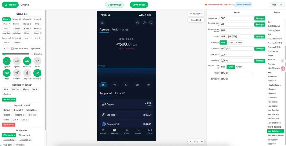
For design practice, internal demos, presentation visuals, and content production, the easiest workflow is to use a browser-based online editor that lets you update fields and review the result instantly. That is where Zoobic is especially useful. Zoobic is a template-based mockup editor with more than 8000 templates across hundreds of categories, including banking-style layouts. You open the template in the browser, edit values in the right-side form, review the left-side live preview, adjust spacing issues, and export PNG when the layout looks balanced. This process keeps the work fast, visual, and easy to control without manual layer editing.
A BBVA statement mockup usually fails to align for simple reasons: text is too long, field types are entered in the wrong place, number formatting is inconsistent, or the chosen screenshot template does not match the intended statement style. Once those points are corrected, the page becomes much easier to polish. For entertainment and learning research only, not for illegal use.
What Field Misalignment Means in a BBVA Statement Mockup
When people search for help with a BBVA statement mockup, they usually describe “misalignment” as a visual issue where one section looks slightly off compared with the rest of the page. This often shows up in three forms: text overflow, spacing drift, or wrong field mapping inside the online editor.
Text overflow happens when a name, account label, branch name, or transaction description is longer than the space allowed by the screenshot template. A single long value can push a line downward, wrap text unexpectedly, or make nearby labels look compressed. In a banking-style mockup, that creates a layout that feels unstable even if the template itself is technically correct.
Spacing drift is more subtle. The page may still be readable, but the rhythm between labels, balances, and transaction lines begins to feel uneven. One amount may be much wider than the others, or one date format may stretch farther than the rest of the row. This is common when users mix numeric styles or add too much extra wording to individual fields.
Wrong field mapping is another frequent cause. In a browser online editor, the right-side form can contain separate inputs for the header, summary, and transaction area. If content meant for a short label is entered into a compact header field, the result will look broken even though the mockup system is working normally.
A strong BBVA statement mockup should hold five core groups clearly: account holder details, masked account or IBAN line, statement period, balance summary, and transaction rows. If one group feels crowded, focus on that section first. Zoobic helps here because the live preview shows each change immediately, making it easier to isolate the exact source of the alignment problem before you export PNG.
Map the BBVA-Style Statement Structure Before Editing
Before typing any data, it helps to read the screenshot template as a layout map. A banking-style mockup usually follows four visual zones: the top section, the summary block, the transaction table, and the footer. Understanding those zones in advance makes alignment corrections much faster inside the browser.
The top section often contains the bank label, account holder name, masked account number, and statement period. These are anchor fields, so they should be entered first and kept consistent across the whole page. If the top section already feels tight, the problem often comes from values that are too descriptive for the available width.
The summary block usually contains opening balance, total incoming, total outgoing, and closing balance. These values need clean repetition. If one field uses extra symbols, longer currency text, or inconsistent separators, the visual balance of the block starts to drift. A BBVA statement mockup looks much cleaner when all numeric fields follow one clear style.
The transaction table is the area where most alignment issues appear. Dates, descriptions, references, and amounts need to sit in predictable columns. One oversized description can change row height and disturb the appearance of nearby entries. When users say a mockup looks off, the source is often here rather than in the header.
The footer should stay light and controlled. A footer note, page marker, or bottom margin area needs enough breathing room to finish the page cleanly. If the last transaction row pushes too far downward, the footer becomes crowded.
Zoobic’s form-based workflow is useful because you can test one section at a time. Enter a short sample into the top section, then check the summary, then review the table. This step-by-step method prevents larger cleanup later and makes the final export PNG look more stable.
Choose the Right BBVA Statement Mockup Template
A better starting template solves many alignment issues before they appear. When creating a BBVA statement mockup, the first decision should be the type of statement layout you actually need. A monthly statement, an account summary, and a transaction-history screen do not behave the same way, even if they share similar banking visuals.
A monthly statement page usually has a stronger header, more room for summary balances, and a longer transaction list. A compact account-summary screenshot template may emphasize balances and labels more than row detail. A mobile banking mockup often includes a status bar, tighter spacing, and narrower text widths. If the chosen layout does not match the intended use, fields may appear misaligned even when the editing is technically correct.
Zoobic makes this step easier because its template library is searchable and organized across many categories. Instead of forcing one layout to behave like another, you can search for a relevant banking mockup, open it in the browser, and inspect the editable structure before entering final content. This is one of the strongest advantages of using an online editor rather than rebuilding a page manually.
Once the template opens, review the right-side form carefully. Confirm that it includes the fields you need for the header, statement period, balances, and transaction rows. Then add a few short placeholder values and watch the live preview react. This quick test reveals whether the screenshot template handles spacing well before you commit to a full page.
A BBVA statement mockup becomes easier to polish when the field set and visual hierarchy are already close to your goal. That means fewer corrections later, cleaner row spacing, and a smoother path to export PNG for presentations, UI references, and content creation.
Fill BBVA Statement Fields in the Right Order
The order of entry matters more than many users expect. A BBVA statement mockup becomes easier to align when fields are filled in sequence, because each section depends on the visual balance of the one above it. Random editing often creates confusion about which field is actually causing the pressure.
Start with fixed identifiers in the header. Enter the account holder name, masked account number, statement period, and bank label first. These are the visual anchors of the page. If the header already looks crowded, simplify the account label or reduce unnecessary wording before moving on. In a browser online editor, this early correction saves time because it prevents multiple later adjustments.
Next, fill the summary values. Add opening balance, incoming totals, outgoing totals, and closing balance using one consistent numeric format. Keep decimal places, separators, and currency presentation uniform. In a banking screenshot template, repeated number styling is essential for a stable visual rhythm. Even a good mockup can look weak if one balance is short and another contains a longer, differently formatted value.
Then move into the transaction rows. Add dates first, then descriptions, then amounts. This sequence helps you see whether the table columns remain balanced as the page fills out. Medium-length descriptions are usually the safest starting point. If one entry needs more detail, test it in the live preview before applying similar wording elsewhere.
Zoobic supports this process well because the right-side form updates the left-side preview in real time. You can enter one group of values, pause, review spacing, and continue only when the section feels clean. This makes the online editor especially practical for anyone building a BBVA statement mockup for learning, mock presentations, or content workflows where clean layout matters before you export PNG.
Fix Alignment Problems Caused by Text Length
Text length is the most common reason a BBVA statement mockup looks uneven. The solution is usually not to redesign the page, but to shorten or rebalance the values that exceed the visual limits of the screenshot template.
Header fields often create the first problem. An account holder name, branch label, or statement title may simply be too long for the available width. In that case, use cleaner wording that preserves the meaning without adding unnecessary length. The goal is to keep the header visually calm. In a compact mockup, every extra character has more impact than users expect.
Transaction rows are even more sensitive. Long merchant names, notes, or references can force a row to wrap and make nearby lines look misaligned. If one row is much denser than the others, shorten it until the line height matches the surrounding entries. A BBVA statement mockup looks much more polished when the table follows a steady visual rhythm from top to bottom.
Balance formatting also affects alignment. Numeric consistency matters just as much as text length. Use the same decimal style, separator pattern, and currency style across the summary and transaction sections. Avoid mixing compact numbers with long textual amount labels, because this breaks column harmony and makes the screenshot template feel less controlled.
Zoobic is effective here because you can test changes one by one in the browser. Shorten a single field, compare the row spacing in the live preview, and continue only if the result improves. That immediate feedback is a major advantage of a form-based online editor. Instead of guessing how the final output will look, you can correct the page progressively and then export PNG once the layout feels balanced.
Adjust the Layout Inside Zoobic
Zoobic is designed for browser-based editing, so layout correction feels direct and visual rather than technical. For a BBVA statement mockup, this matters because alignment issues are rarely solved by one large change. They are usually solved by a series of small, visible refinements.
The most helpful feature is the live preview on the left side of the screen. As you edit fields in the right-side form, the mockup updates immediately. This allows you to compare header spacing, balance placement, and transaction row behavior without leaving the page. In a practical workflow, you should review the preview after every major field group rather than waiting until the end.
Zoobic also supports small interface details that influence realism and spacing, especially when the chosen screenshot template is mobile-oriented. Status bar elements such as time, battery, signal, and carrier should match the visual style of the page. If those top-edge details are inconsistent, the bank header can feel less balanced even when the main text fields are correct.
Transaction row tuning is another strong use case. You can add or remove entries to fit the intended statement length and maintain a comfortable bottom margin. If the page feels crowded, reducing one row may solve the entire composition more effectively than shrinking several text fields. This is one reason a template-driven online editor is so useful for mockup creation: it encourages structural adjustments instead of messy manual edits.
Zoobic also supports high-definition output, so once the layout looks correct on screen, you can export PNG with confidence. For design references, visual demonstrations, learning projects, and content production, that clean export path is a major practical benefit.
Build a Realistic BBVA Statement Mockup for Presentation
A realistic BBVA statement mockup is not only about alignment. It also depends on internal consistency. The page should read like one coherent scenario, with matching balances, dates, and row structure from top to bottom. This keeps the screenshot template believable for presentations, creative projects, and visual demonstrations.
Start by deciding the overall scenario before filling every field. Keep the account profile, statement period, and transaction activity connected to one clear story. If the summary block shows a modest opening balance, the transaction list should reflect movement that leads naturally to the closing balance. A mockup feels cleaner and more professional when the sections support each other visually and logically.
Chronological order also helps. Place transaction rows in a steady sequence and keep the table easy to scan. Consistent date formatting, amount alignment, and reference length make the page feel deliberate instead of improvised. This is especially important in a BBVA statement mockup, where much of the visual credibility comes from repetition and order rather than decorative design.
Zoobic’s browser workflow supports this kind of refinement because you can build the page gradually and review every section in context. The online editor lets you compare the top summary with the middle rows and the lower margin at the same time. That full-page visibility is useful when deciding whether to shorten a row, reduce a label, or remove an extra entry before you export PNG.
When the layout, scenario, and spacing all support each other, the result is much stronger. The final image becomes suitable for content creation, interface studies, internal visual demos, and learning research where a clean screenshot template is more useful than a crowded or inconsistent page.
Export the Finished Mockup as PNG
The final stage of a BBVA statement mockup should be calm and methodical. By the time you are ready to save the image, most alignment issues should already be resolved in the browser. The last review is about confirming visual stability from top to bottom before you export PNG.
Begin with the header. Check that the account holder name, masked account number, statement period, and bank label all fit without clipping or awkward wrapping. Then review the summary block and confirm that all balances use the same numeric style. Small inconsistencies stand out more at the end because the overall page is already close to finished.
Next, inspect the transaction table line by line. Look for row height changes, uneven amount alignment, or descriptions that feel denser than the surrounding entries. In a good screenshot template, the table should read with a smooth rhythm. If one row interrupts that rhythm, adjust it before export. A single correction often improves the whole page more than a large redesign.
Finally, review the footer and lower margin. The page should end with enough breathing room to feel complete. If the bottom looks crowded, reducing the last row or shortening note text is often better than forcing everything into a tighter space.
Common BBVA Statement Mockup Issues and Corrections
Several recurring issues appear in almost every BBVA statement mockup workflow, and each one has a simple correction when handled early. The key is to treat the screenshot template as a structured layout instead of a freeform canvas.
Header crowding is one of the most common problems. This usually comes from overly long names, repeated labels, or an oversized date range. The correction is to simplify the wording and keep the top section to one or two clean lines where possible. In a compact mockup, strong restraint produces better results than extra detail.
Table drift is another frequent issue. If one transaction row contains much more text than the others, the entire list can feel uneven. Keep descriptions and references within a similar length range so the columns remain stable. In a browser online editor, this is easy to test because the preview updates after each change.
Footer crowding appears when too many rows are added or when lower-page notes are unnecessarily long. The best fix is often to remove one row or shorten the final note rather than compressing the entire page. A BBVA statement mockup should end cleanly, not feel forced into the available space.
Formatting inconsistency is a quieter but important problem. Mixed separators, uneven decimals, and different amount styles reduce the polished feel of the page even when text spacing looks acceptable. Keep the entire screenshot template under one formatting logic and the visual quality improves immediately.
Zoobic supports all of these corrections through a simple form-and-preview workflow. That makes it practical not only for experienced creators, but also for users who want a fast mockup process without complicated graphic editing before they export PNG.
A Practical Browser Workflow for Cleaner Alignment
A repeatable workflow is the fastest way to keep every BBVA statement mockup neat and consistent. When the process stays the same, alignment becomes easier to control and each new version takes less time to finish.
Start by searching Zoobic’s template library for a suitable banking screenshot template. Open the chosen design in the browser and inspect the right-side field list before entering final content. This first check reveals whether the online editor supports the exact header, summary, and transaction structure you need.
Next, fill the page in order: header first, summary second, transaction rows third, footer last. After each stage, pause and review the live preview. If the top section is already crowded, fix it immediately instead of pushing the problem further down the page. This step-by-step method keeps the mockup stable and reduces late-stage rework.
Then refine for consistency. Keep names compact, use one number format, control transaction description length, and maintain comfortable spacing at the bottom of the page. A good BBVA statement mockup rarely comes from adding more detail. It usually comes from choosing the right detail and presenting it with discipline.
Finally, review the full page one last time and export PNG. If you need multiple versions, duplicate the same structure and change only the necessary fields. This keeps the visual standard consistent across your outputs. For entertainment, creative visuals, internal presentations, and learning research, Zoobic provides a practical browser-based online editor workflow that turns a rough banking mockup into a polished final image.