Choose the Right Westpac Mobile Banking Mockup First
A clean Westpac mobile banking mockup usually starts with the right screenshot template, not with the last-minute field edits. In Zoobic, the fastest way to avoid spacing problems is to choose a layout that already matches the exact screen you want to present. A balance view, transfer confirmation, transaction detail, and account summary all follow different spacing rules. If the structure is wrong from the beginning, even careful edits in the online editor will still leave the screen looking uneven.
Zoobic is built for this kind of browser-based workflow. You open the template library, search by bank name, screen type, or a close UI pattern, then edit the fields on the right while checking the live preview on the left. That setup is helpful because you do not need to manually rebuild interface elements. Instead, you work directly inside a banking mockup that is already shaped for presentation, learning materials, and content creation.
Before you type any final details, check the frame itself. Look at the top status bar, the central content area, and the lower safe area. A good screenshot template should already feel balanced before any text is added. If the header is too heavy, the central block too narrow, or the lower section too crowded, the final export PNG is likely to inherit those issues.
This is especially important with a Westpac mobile banking mockup because banking screens depend on clarity. A transfer receipt needs neat stacked details. A balance screen needs one dominant number. A transaction list needs rows that scan easily. Starting from the closest layout reduces the amount of correction needed later and makes the browser editing process much faster.
Zoobic’s large template library is one of its strongest advantages here. With more than 8000 templates across hundreds of categories, you can begin with a suitable banking screenshot template instead of forcing one screen type to behave like another. That alone solves many alignment problems before they begin.
Understand Why Fields Stop Lining Up
When a Westpac mobile banking mockup looks misaligned, the cause is usually simple. The most common problem is text length. A banking template may have narrow areas for account names, transaction descriptions, dates, references, or note fields. If one of those values becomes too long, the layout starts to wrap, shift, or crowd neighboring elements. In most cases, the issue is not the design itself. It is the relationship between the text and the spacing inside the mockup.
Another common issue is inconsistency. A transaction history screen may look fine until one merchant name becomes much longer than the rest. A receipt-style screenshot template may feel balanced until one reference line contains too many digits. A balance view may lose its visual hierarchy when a secondary label becomes longer than the main headline. Good alignment depends on rhythm. Similar rows need similar visual weight.
The top section can also create problems. If the time, signal, battery, or carrier field is too busy, the entire screen can feel off even when the content block below is technically correct. Zoobic includes status bar controls inside the online editor, so you can refine these details without leaving the browser. A small change at the top often restores balance to the entire composition.
Another reason fields stop lining up is overfilling optional content. Many users try to complete every editable field in a screenshot template, but that is not always the best result. A cleaner mockup often comes from selective editing. If a field does not strengthen the screen story, it is better to shorten it or leave it unused.
A practical mindset is to treat every field as part of a visual system. In Zoobic, each change updates the preview instantly, so you can judge whether a value improves the layout or harms it. That live response is one of the reasons Zoobic works well for UI demos, learning research, and visual content production. It helps you fix the real cause of misalignment instead of guessing.
Edit Fields in the Best Order Inside Zoobic
A Westpac mobile banking mockup becomes much easier to manage when you edit the fields in a logical order. In Zoobic, the right-side form editor lets you adjust each item directly while the left-side preview updates in real time. Because the platform is an online editor, you can correct alignment step by step without dragging layers or rebuilding the screen manually.
The best starting point is the main content anchor. On most banking screens, that means the account name, recipient, or headline label first, followed by the amount. Those two values define the visual center of the mockup. Once they are in place, you can judge how much space remains for secondary details such as the date, time, reference number, transaction ID, and note text.
This order matters because it protects the screen hierarchy. If you start by filling long note fields or secondary labels, they may distort the layout before the important values are even visible. By placing the key elements first, you can make smart adjustments early. In a transfer confirmation screenshot template, for example, the amount should remain visually strong. If a long account label pushes that value down or breaks the spacing around it, shorten the label before continuing.
Zoobic’s form-based workflow is designed for this exact use case. You can update names, amounts, timestamps, account tags, and status bar details without leaving the browser. Every change appears immediately in the preview, which means the online editor supports quick correction rather than trial-and-error exporting.
A helpful sequence for most banking templates is simple: main account or recipient, amount, date and time, reference fields, secondary labels, then optional notes. This approach works across receipt views, summary screens, and transaction records. It also improves the final export PNG, because the most important lines stay stable while the smaller details are tuned around them.
For repeat work, this method becomes even more efficient. Once you learn which field lengths fit a specific screenshot template, you can reuse the same editing pattern on future Westpac-style screens. That turns Zoobic from a one-time editor into a consistent production workflow for clean banking mockup images.
Fix Long Text Before It Breaks the Layout
Long text is the most frequent reason a Westpac mobile banking mockup stops looking clean. Banking interfaces often use narrow columns and compact rows, so a field that seems harmless can quickly create wrapping, collisions, or uneven spacing. The easiest fix is to identify which fields are naturally short and which ones carry a higher layout risk.
Short fields usually include the amount, date, time, balance label, and status details. Long fields usually include recipient names, account nicknames, merchant descriptions, payment notes, and reference text. In almost every screenshot template, the long fields deserve extra attention because they control how much vertical space the mockup consumes.
Inside Zoobic, start with concise but realistic values. If a transaction description wraps to two lines, shorten it until the row returns to one clear line. If an account label feels too heavy, reduce it to the essential words. In a browser-based online editor, these small changes are easy to test because the preview reacts immediately. You do not need to guess what the final export PNG will look like.
Consider a transaction detail layout. If the merchant name is too long, every line below it may appear lower than expected. The problem can spread through the whole screen, making a neat mockup feel disorganized. The best correction is usually not adding more detail, but reducing the text to match the design rhythm of the screenshot template.
The same principle applies to receipt screens. Reference numbers, confirmation labels, and supporting notes should be compact. The amount and the main transaction identity should remain easy to read at a glance. Zoobic’s online editor makes this process efficient because one or two character changes can immediately restore the layout.
This is also where professional content creators gain speed. Instead of rebuilding screens from scratch, they learn the text limits that work best inside each template. Zoobic supports that workflow well because it combines a searchable library, form-based editing, and live preview in one browser session. The result is a more polished Westpac mobile banking mockup and a cleaner export PNG for demos, slide decks, and interface walkthroughs.
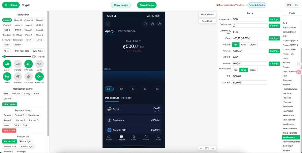
Adjust the Status Bar for Better Visual Balance
A Westpac mobile banking mockup can feel wrong even when the main content looks correct. In many cases, the real issue sits in the status bar. The time, battery, signal, carrier text, and top device spacing influence how the viewer reads the entire screen. If the top edge feels crowded or visually heavier than the content below, the whole mockup can appear misaligned.
Zoobic includes status bar controls as part of its online editor, which is a practical advantage when working on banking screenshot template layouts. You can modify the time, battery level, signal strength, and other top-bar details directly in the browser. That means you can keep the design consistent without opening a separate design app or manually editing interface parts.
The best approach is simplicity. A banking mockup usually looks strongest when the status bar supports the screen rather than competing with it. Use clear time formatting, keep the carrier field compact if the template includes one, and make sure the indicators do not crowd the notch or top edge. If the header area becomes too busy, the content block below may seem narrower than it really is.
This is especially important on transfer and receipt screens, where the upper part of the layout needs to lead the eye smoothly into the main amount and confirmation details. If the status bar is oversized or visually noisy, it interrupts that reading flow. In Zoobic, you can test these changes instantly because the left preview updates while you edit the right-side fields in the online editor.
A small correction can make a large difference. For example, if the top line uses an overly long carrier label, the whole frame may feel stretched. After shortening that field, the screenshot template often looks balanced again. That is why the live preview is so useful. It helps you judge the screen as one complete composition instead of a collection of separate text entries.
For presentation assets, this matters more than many users expect. A polished export PNG depends on overall harmony, not just correct content. Zoobic’s built-in top-bar editing tools are valuable because they help you finish a Westpac mobile banking mockup that looks refined, believable, and ready for use in learning research or creative content.
Build Better Balance, Transfer, and Receipt Screens
Not every Westpac mobile banking mockup should be edited in the same way. Different banking screen types follow different visual priorities, so the best alignment strategy depends on the structure of the screenshot template you choose. Zoobic helps because its template library includes many layout styles, and the online editor makes it easy to adapt each one inside the browser.
For a balance screen, the main balance should stay dominant. The account name should be short enough not to compete with the headline figure. Secondary balances, subtitles, or support labels should stay lighter and less crowded. If too many details appear above or below the main number, the screen can lose focus. In this type of mockup, less text usually creates a stronger result.
For a transfer confirmation screen, the order of information matters most. The amount, sender, receiver, and core confirmation line should form a clean reading path. Supporting fields such as references and timestamps should be compact. If the confirmation wording becomes too long, shorten it before changing anything else. The vertical rhythm of a receipt-style screenshot template depends on concise lines.
For a transaction history screen, consistency is the key. Merchant names should follow a similar length pattern when possible. Dates and times should use one format. Amount rows should align visually so the screen reads as a clean list. Zoobic’s live preview is especially useful here because row-based banking mockup screens can look fine field by field but uneven when viewed as a whole.
The advantage of using Zoobic for these edits is speed with control. You can switch between templates, adjust field values, refine status bar details, and prepare the final export PNG without leaving the browser workflow. Because the online editor is form-driven, the process stays focused on content and spacing rather than manual layout repair.
This makes Zoobic well suited for designers, educators, marketers, and content creators who need banking UI visuals for presentation. A Westpac mobile banking mockup should communicate the structure of the screen quickly. When the layout matches the screen type, the content stays concise, and the screenshot template is edited with care, the result looks much more professional.
Use Live Preview as Your Main Quality Check
The most efficient way to improve a Westpac mobile banking mockup is to edit and review at the same time. Zoobic is designed around this workflow. The left-side preview shows the current screen, and the right-side field editor lets you make precise updates without leaving the browser. This live response is one of the platform’s biggest strengths because alignment issues are easier to fix the moment they appear.
When working inside a banking screenshot template, make one meaningful change at a time. Update the account name, then pause. Adjust the amount, then review the spacing again. Refine the reference line, then check whether the lower section still feels balanced. This step-by-step approach makes the online editor more effective because you always know which change affected the screen.
Watch for a few common warning signs. Text touching the edges, labels wrapping unexpectedly, one line becoming much longer than the surrounding lines, or the footer area starting to crowd the content are all signs that the mockup needs another pass. The status bar should also be checked during this stage, since a top-heavy screen can mislead you into thinking the center content is the real problem.
This method is faster than making many edits at once and only checking the result at the end. In a form-based online editor, small corrections are usually enough. One shortened merchant name, one cleaner balance label, or one simplified top-bar field can restore the visual rhythm of the entire screenshot template.
Zoobic’s live preview also helps maintain purpose. A banking mockup is most useful when it stays clear, readable, and easy to understand. Whether you are preparing a teaching slide, a UI demonstration, a product explanation, or creative content, the screen should communicate instantly. The preview encourages that discipline because every field change is visible immediately.
For users who create multiple screenshots, this becomes a repeatable system. Search for a suitable template, edit in the browser, monitor the live preview, refine the spacing, then export PNG when everything looks stable. That sequence is simple, practical, and well suited to presentation-focused content creation.
Export a Clean PNG and Reuse the Workflow
A strong Westpac mobile banking mockup should still look balanced at the moment of export. Before you save the final image, review the full frame at a realistic viewing size. A layout that seems acceptable when zoomed in may show spacing problems when seen as a finished presentation asset. This final review is where small fixes can greatly improve the quality of the export PNG.
Check the main amount first. It should remain easy to spot and visually centered within the screen hierarchy. Then review the labels around it, the top status bar, the lower footer or safe area, and any row-based content such as transaction history. A good screenshot template should feel complete from edge to edge, with no clipped text and no field that appears unusually crowded. In Zoobic, this is easy to inspect because the online editor keeps the preview visible throughout the process.
This repeatable workflow is one of Zoobic’s most practical benefits. It supports more than a single banking image. Once you identify which text lengths, date formats, and field patterns work best in a specific Westpac mobile banking mockup, you can reuse those choices in future balance screens, transfer confirmations, and transaction views. That saves time and improves consistency across multiple assets.
Zoobic is an online screenshot template editor built for fast field updates, real-time preview, and HD PNG output. Its large template library, browser editing experience, form-based controls, and status bar customization make it a useful choice for mockups used in content creation, demos, and interface learning research. It is suitable for entertainment and learning research only, and should not be used for unlawful purposes.